Letter
The space within a word
Compare a short headline at two spacing settings and inspect its texture at reading distance.
Typography, editorial rhythm and print
Toralvex treats a publication as a sequence of reading decisions. Explore hierarchy, spacing and physical proofs through practical editorial exercises.
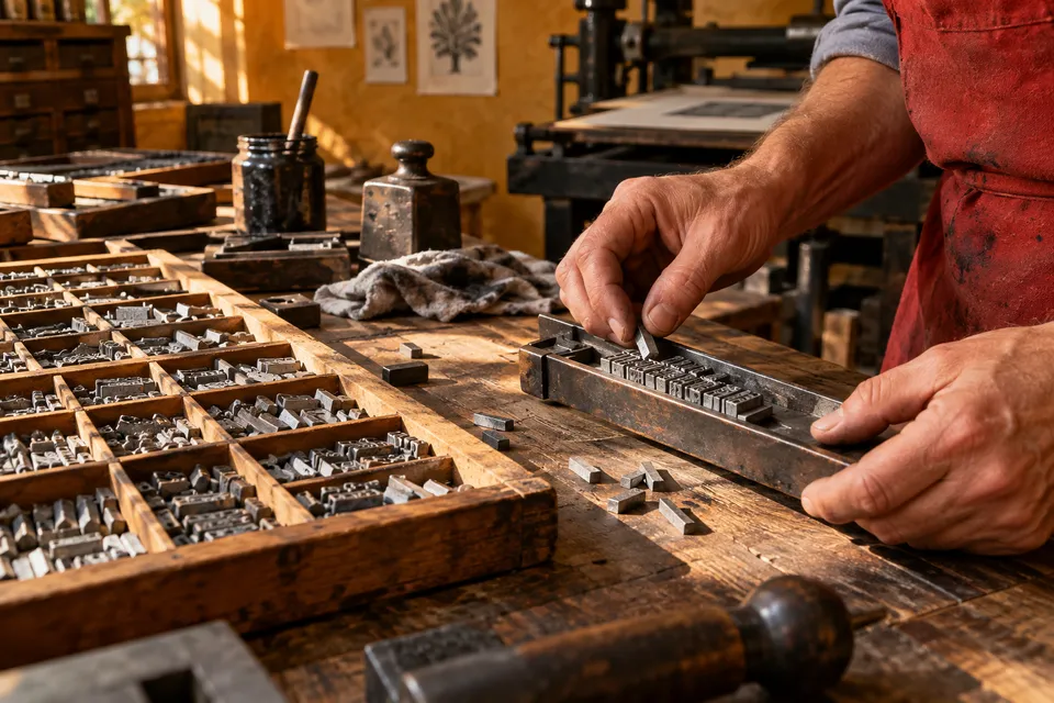
Before adjusting a type size, decide what the reader needs to encounter first. Hierarchy connects the editorial purpose with the path through the page.
02 / Working modes
Inspect a printed spread without reading every word. Identify the first three elements you notice and decide whether their order serves the content.
Change the spacing or hierarchy in a small proof while holding the other choices steady. Compare the versions on paper rather than through different zoom levels.
Give someone a specific piece of information to find. Observe which cues they follow before explaining what you intended the layout to do.
03 / From eye to hand
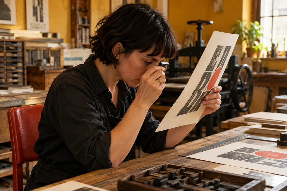
Print a modest sample at its intended size. Check the relationship between line length, spacing and paper before trusting the apparent balance of a zoomed screen.
Compare a short headline at two spacing settings and inspect its texture at reading distance.
04 / A route through the edition
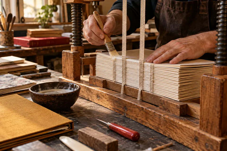
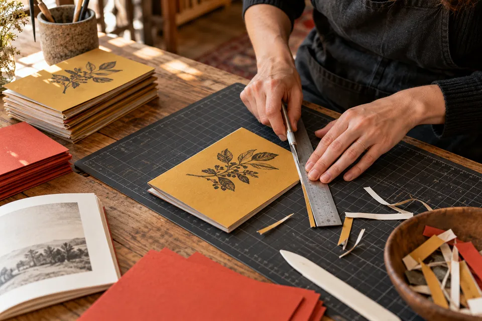
Collect content, establish an order, inspect a proof and prepare the reading object. Each pass has a different question and should leave a clear decision.
Compare a short headline at two spacing settings and inspect its texture at reading distance.
Use the outside edge as room for a note, a pause or a clear boundary.
Check whether the inner content remains comfortable when the bound object is held naturally.
Compare two weights before introducing another family into the hierarchy.

05 / Editorial conversation
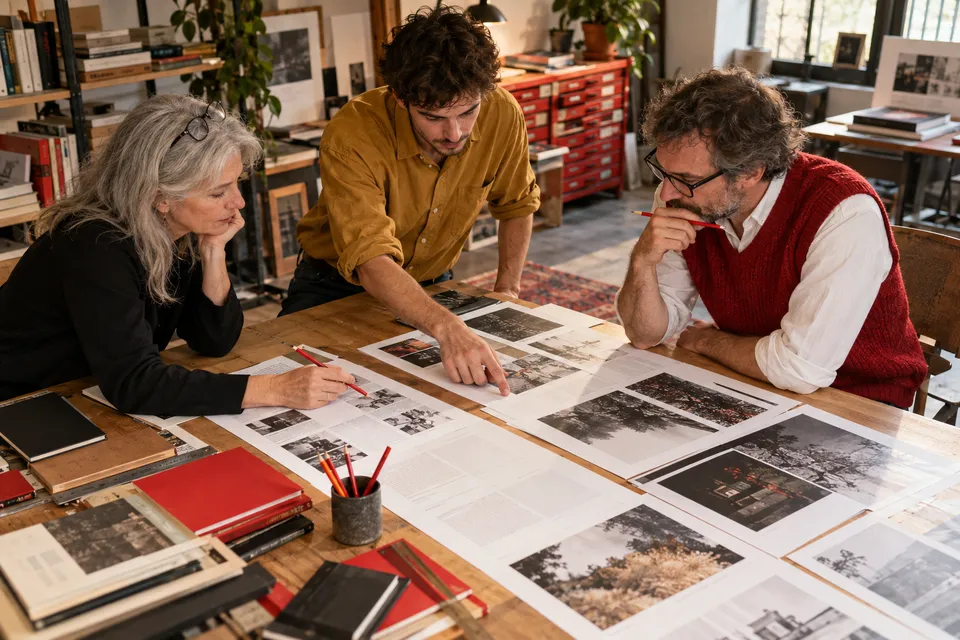
Ask someone to locate a passage without giving them a route. Notice the headings, captions or spacing they use, then compare that behaviour with your intention.
06 / A reference index
Filter by letter, page or book to focus your next trial. These prompts connect a typographic detail with its effect on reading.
5 prompts available
Compare a short headline at two spacing settings and inspect its texture at reading distance.
Use the outside edge as room for a note, a pause or a clear boundary.
Check whether the inner content remains comfortable when the bound object is held naturally.
Compare two weights before introducing another family into the hierarchy.
Position the caption so the reader can associate it with its image without searching.
07 / Proofing session
Review the page as both a visual composition and a reading object. This checklist resets when the page reloads; it is a session aid rather than a saved record.
0 / 6 complete

08 / A physical reading room
Place related proofs where they can be compared at the same scale. Keep notes about what changed so a later improvement can be connected with a specific decision.
Read the editorial exercises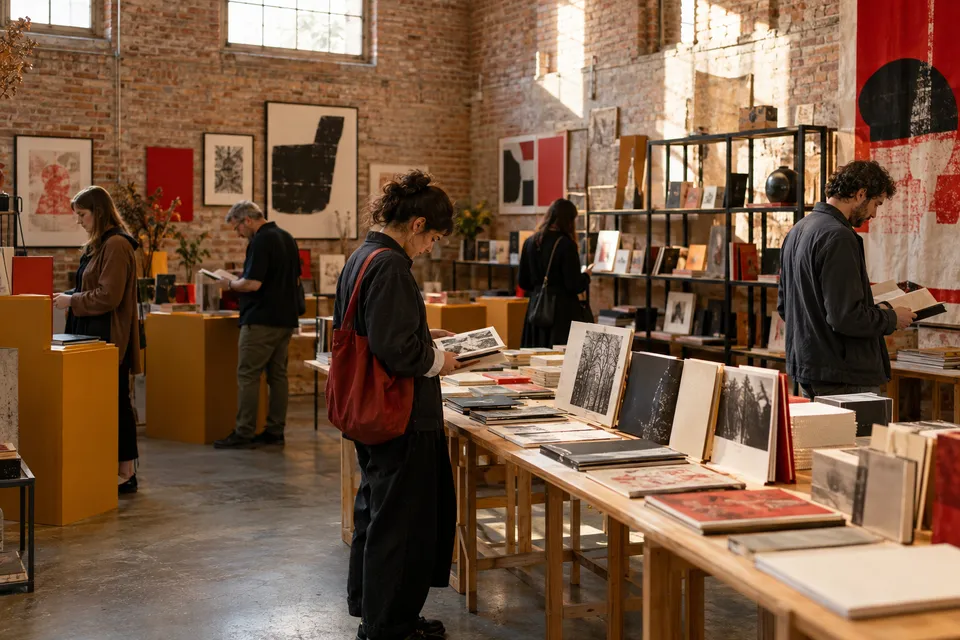
09 / Showing the work
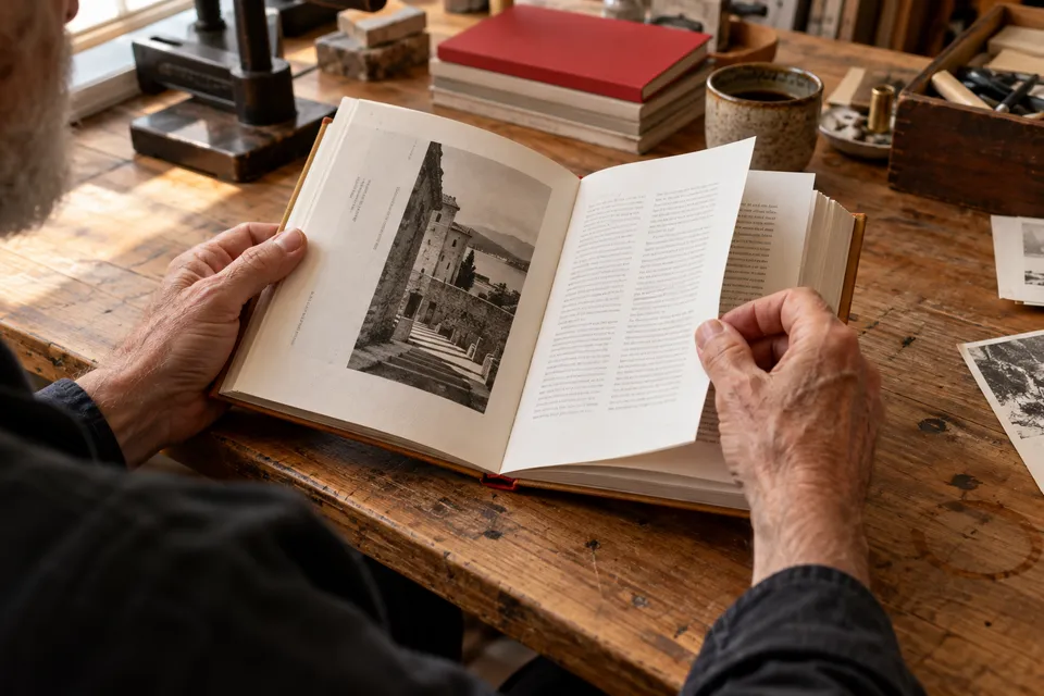
Show the size, opening and intended distance. A good presentation lets someone understand the object without substituting a dramatic photograph for a readable page.
Position the caption so the reader can associate it with its image without searching.
10 / The resulting object
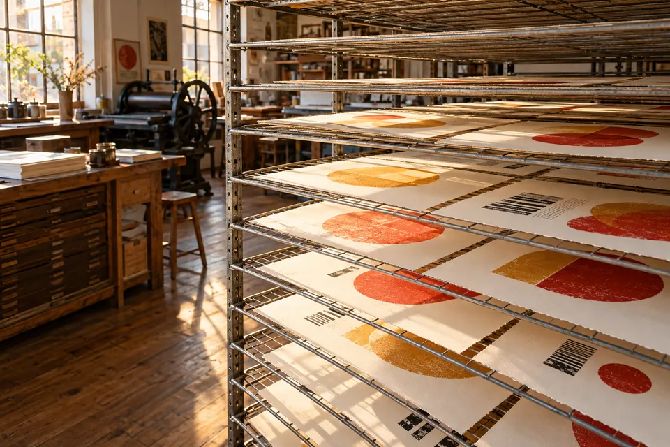
Binding, trim and paper influence how the sequence is experienced. Revisit the layout when the physical proof reveals a tighter opening or an unexpected pause.
11 / Practical typography
Typography becomes more useful when its decisions can be tested. These answers suggest compact exercises for common editorial uncertainties.
12 / Production memory
Record one choice about the publication that another maker would need to understand. A concise note can preserve the reasoning behind the finished object.
Give someone a specific piece of information to find. Observe which cues they follow before explaining what you intended the layout to do.